
A toolkit designed to Capture and Archive event insights
NUS DID thesis project by:
Srikesh Sundareasan
Under the supervision of:
Tiffany Loy
Special thanks to:
Yuta Nakayama
Marcus Lim
Edmund Zhang

The process
Researched visitor tracking after noticing manual counting at galleries.
Interviewed event planners and museum operators to validate tracking needs.
Built a computer vision toolkit for visitor tracking, heat maps, and dwell time analytics to automate visitor behavioral measurement for event planners.
Learned that “nice-to-have” features don’t scale well -> the industry works fine without quantitative tracking
Shelved commercial pursuit, using it as personal tool.
Project Video
About Spacevise
An analytics toolkit for event planners: Record. Upload. Consolidate.
Co-designed with event managers at Singapore Science Park to turn event footage into actionable insights. The system converts event footage into visitor count visualizations and heat maps of high-traffic areas. Helps planners quantify what worked, consolidate post-event reports, and optimize future events.
Deployed and tested at two live events: NUS DID Gradshow (2024) and AIC Life Unstoppable Roadshow at Tampines Hub (2025).


The origins
This started from an observation at the Singapore Chinese Cultural Center: staff at galleries manually counting visitors with handheld clickers. They tracked footfall for KPIs but had zero tools to analyze how people actually moved through exhibits.
Through conversations with curators at Singapore Art Museum and event managers at Singapore Science Park, I learned they cared about audience engagement and analytics. In museums, the data came from manual counters and survey-takers roaming with iPads. At roadshows and open events, event managers relied on intuition to gauge success rates of an event.
The obvious question: could technology collect this data more efficiently, provide insights beyond total attendance, and integrate with event planners’ existing workflows?
Prototyping
I started by testing what could actually be measured in exhibit spaces without disrupting the visitor experience. My first implementation was a hand tracking system that could overlay artwork info on the artworks themselves. It worked to detect user engagement (interaction time), but the system became the exhibit. People focused on making gestures instead of looking at the art. This wasn’t it.
My next implementation was a face detect system that tracked gaze patterns passively through webcam. I was able to detect where the user was gazing in an artwork. This in turn felt like too much information – I just needed to know if and how long a visitor was engaged here, the minutia was too much data. This too, wasn’t it.
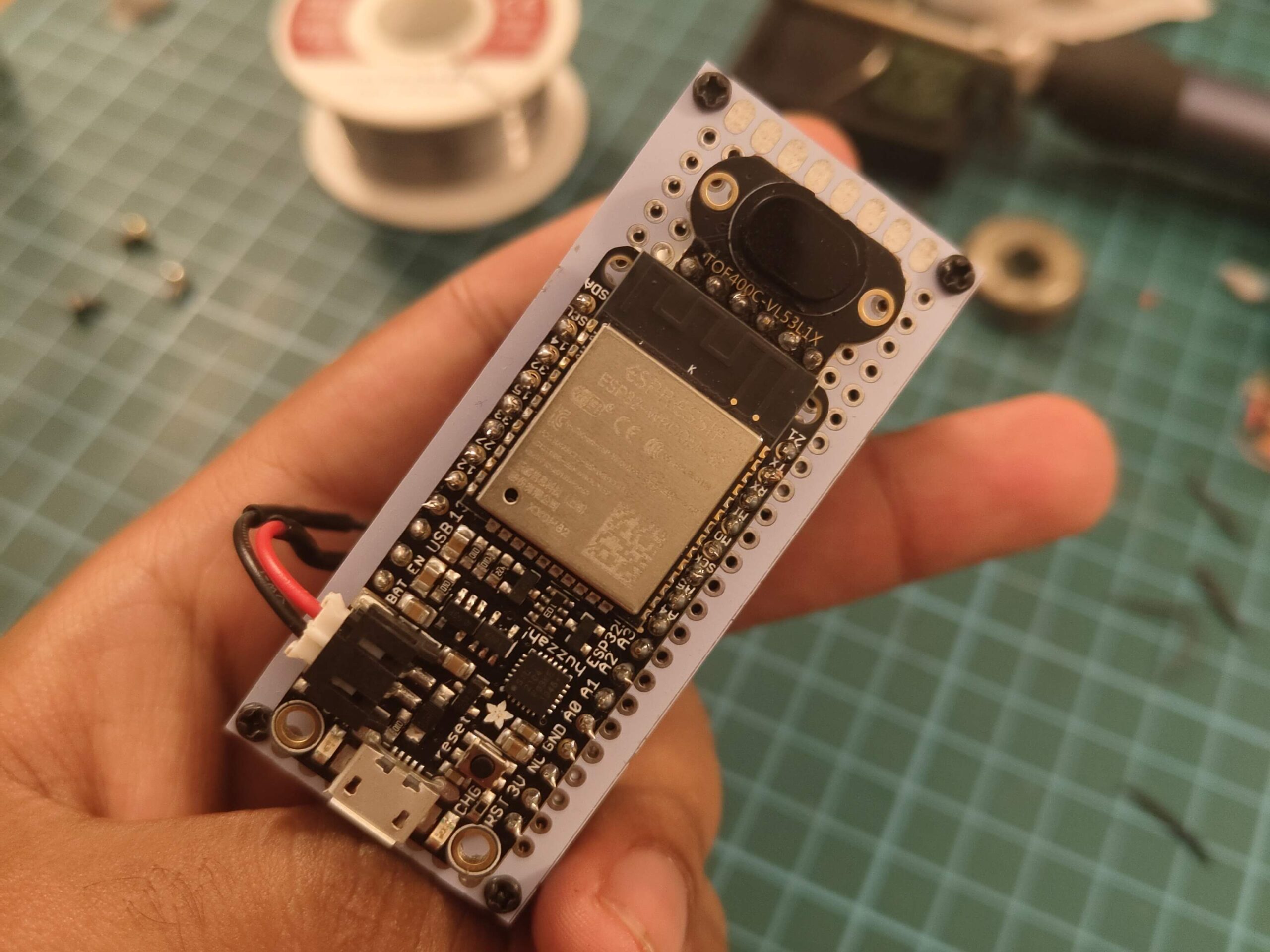
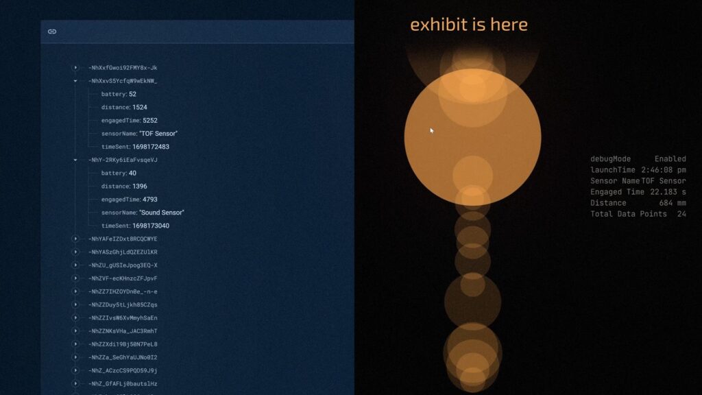
My third implementation was a TOF wireless module. Tiny sensors hidden in art frames that detected presence when someone lingered for a set amount of time in front a space. Linked to a Firebase server, this module transmitted data to a rudimentary dashboard.
Collaborating with Event Managers
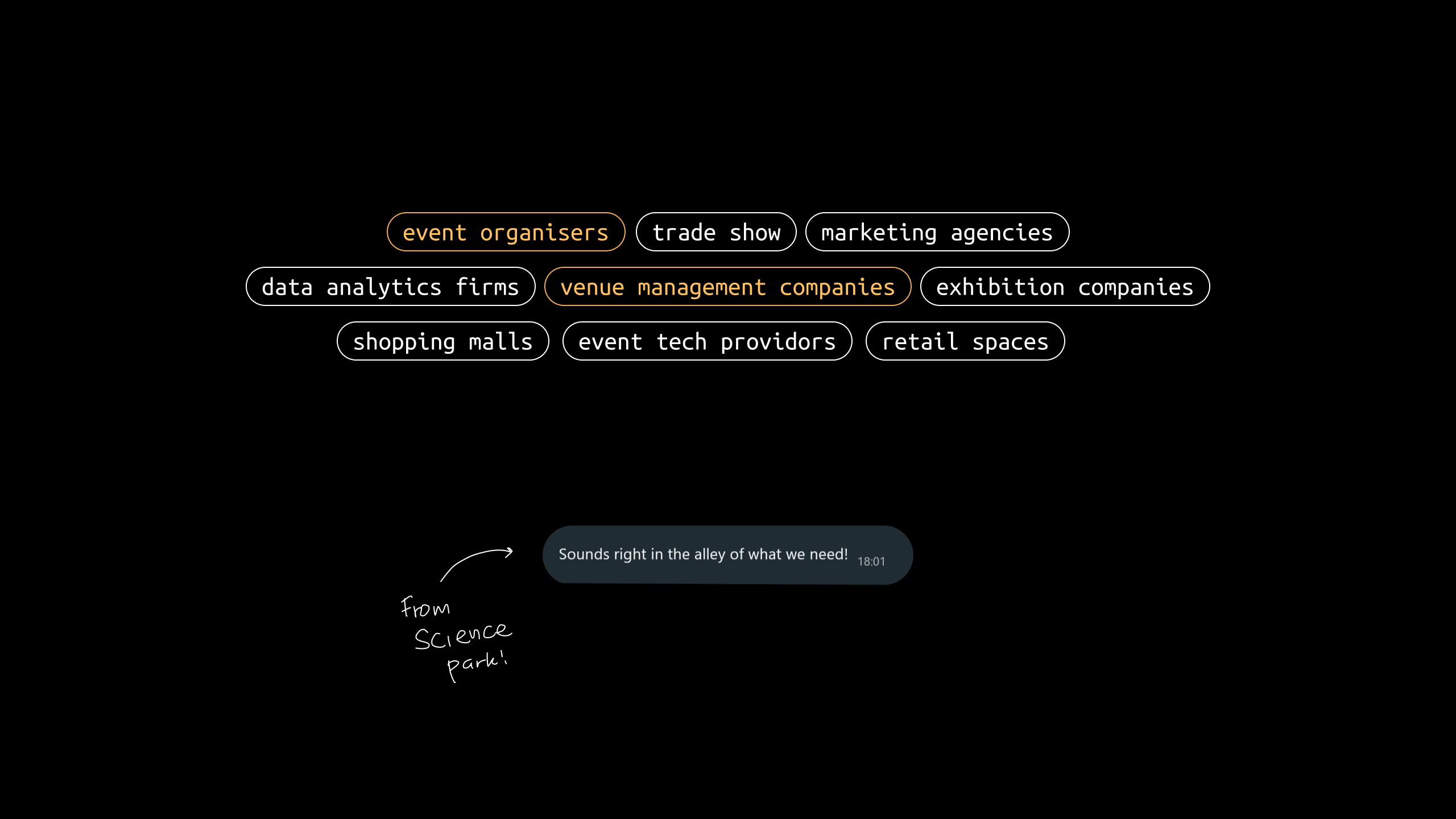
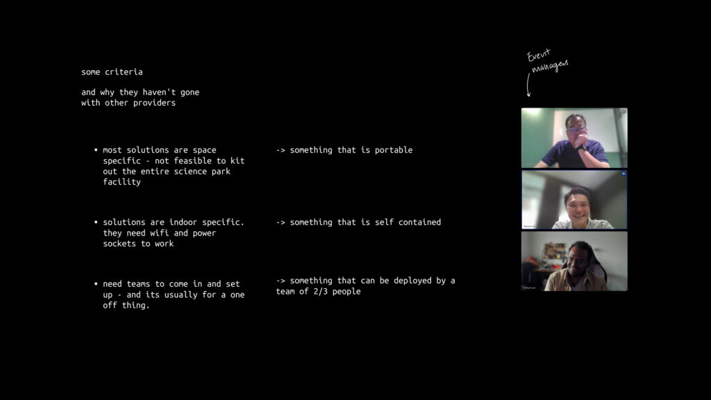
It was around this time that I got in touch with event managers at Science Park (Kent Ridge). After consulting them, I realized that running analytics for entire event spaces with individual sensor modules approach wouldn’t scale. Installing sensors everywhere, running power to each location, managing dozens of wireless modules wasn’t practical for their operations.
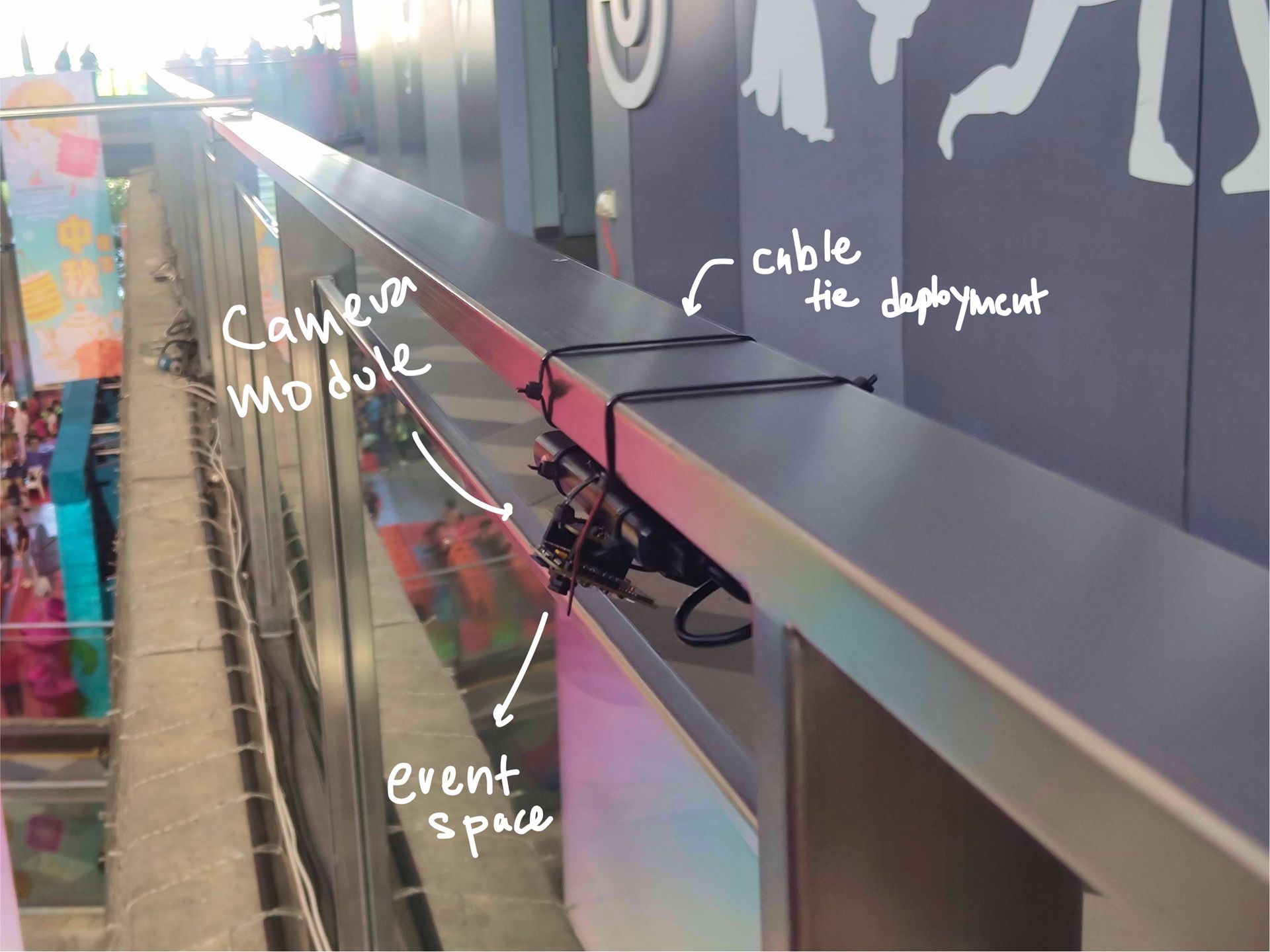
So I pivoted to using camera modules and computer vision models to extract behavioral insights in spaces. In an ideal world, this system can just plug into the security cameras in most places. However, I couldn’t get access to it (duh) so I whipped up a quick ESP32Cam-security camera and cabled tied it to railings to extract visitor info at exhibits. This setup was also deployed to test user data during the AIC Life Unstoppable Roadshow in 2025.
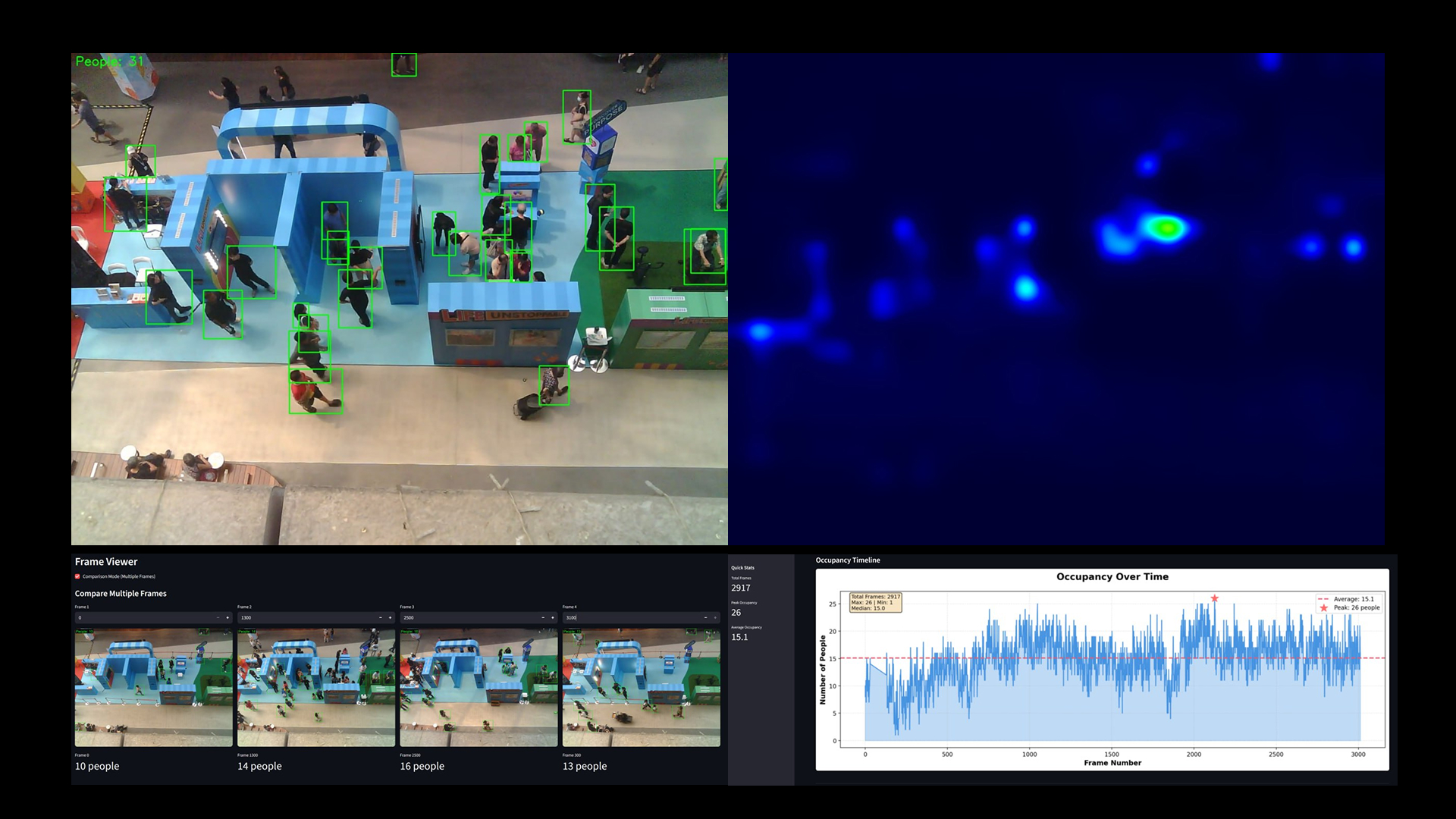
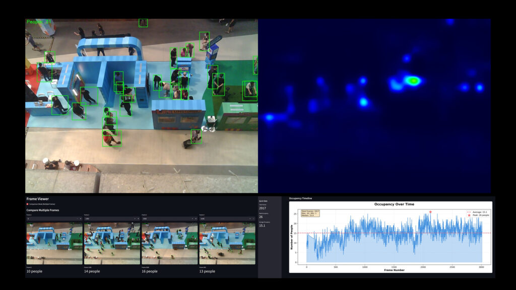
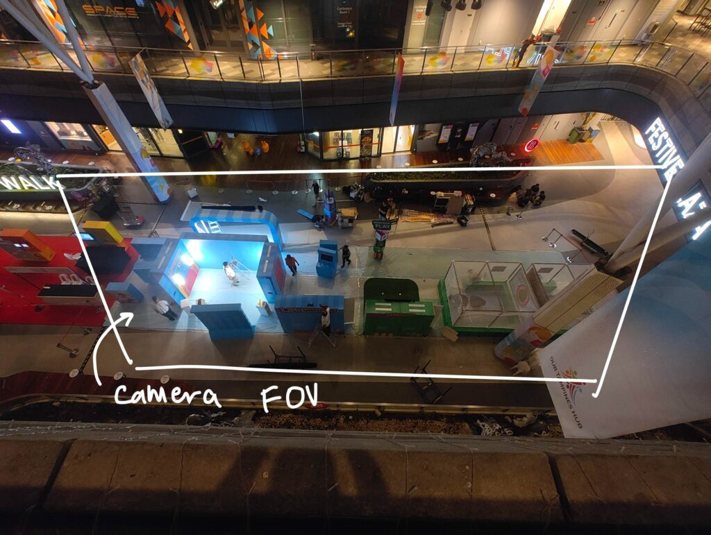
These recording were then fed through a series of computer vision models. The Ultralytics YOLO model was used to detect users and flow patterns. CNN based-density/crowd estimation models were also used in tandem for more accurate crowd counting. Finally the data was saved and presented via an online dashboard that showed crowd statistic over the event’s time period.
In the data above, post event, we could easily see which exhibit items garnered the most engagement using dwell time heat maps and visitor inflow patterns. This data could inform future event planning: where to place high-value exhibits, when to schedule staff, how to allocate resources.
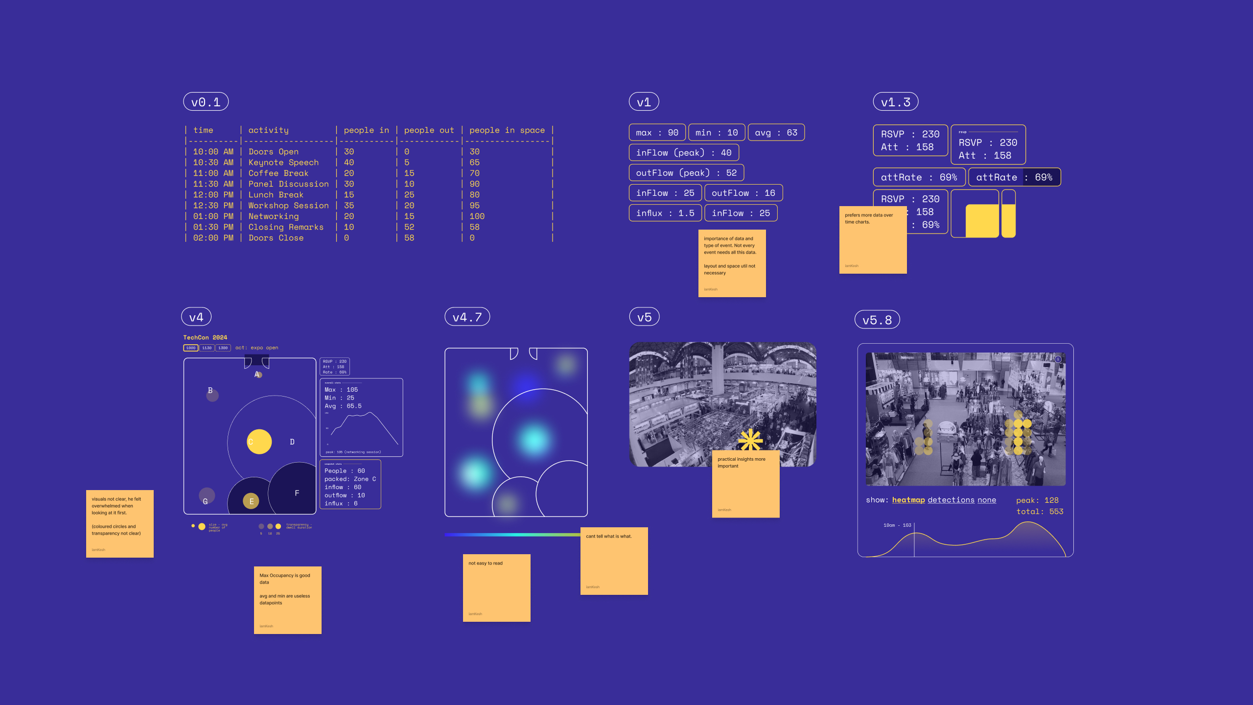
When the initial prototypes were promising, I focused on the data visualization. Early dashboard iterations were then tweaked with event manager’s direct feedback.
Via user validation it became clear that my UI was way too complex and overwhelming at a glance. Event managers needed metrics they could scan quickly for post-event reports: max occupancy for safety planning, peak times for scheduling insights, attendance rates against RSVP numbers. A cleanup of this was made, and that concluded the thesis submission.
Post thesis learning
While on the surface the project ended, I spent the following year making plans and pushing the models performance. A huge rewrite was made, as the initial detection algorithm ran fully in the web. After pushing the logic and deploying everything on a python back-end the program finally became a plausible product for market testing and deploying in the real world.
The project was deployed at the NUS DID Gradshow (2024) and AIC Life Unstoppable Roadshow at Tampines Hub (2025). The system worked. The analytics were usable. In fact, the data points were even shown as a reference for KPI targets.
But when monetisation conversations hit, a pattern emerged. Visitor analytics was “nice-to-have,” not essential. Event planners valued the concept but their existing workflows functioned fine without quantitative tracking. The data I was providing was interesting, but it wasn’t solving a problem urgent enough to change how they operated. The value Spacevise was post-event, something that could be used for learning, but it doesn’t do anything for the roadshow that had already passed. Retrospective event management analytics only help future events, not the current one. And if events aren’t recurring or if planners aren’t iterating based on data, the value drops to near zero.
Conclusion
Overall, this project taught me more about product validation than I expected. I built a working system, deployed it at real events where it got used for actual KPI reporting. The user research made sense and the tech worked. The failure wasn’t in execution, it was in the business model.
Shelved it as a commercial product, but keeping it as a personal tool. When I’m designing exhibitions and need objective retrospective analytics, I’ll pull it out. The thesis question was worth exploring, even if Thanos snapped away its commercial value.
