
The project’s brief:
Design a Memorable and Playful Experience with Accessible Devices
And we did – as part of Tinycade, in collaboration with VivitaSG.
Team:
Aileen Ooi (UI/UX/Frontend Dev)
Srikesh Sundareasan (Design & Dev)
Madison Lovelace (Prototyping)
Prasanth Kumar (Code Support)
Under the supervision of
Clement Zheng

my role
Concept and Ideation, iterations on Interaction UX – slashing and defensive movements
Translated actions into code, tested and deployed interaction logic.
Gained knowledge in developing physical interactions for digital devices.
project video
About Cardboard & Dungeons
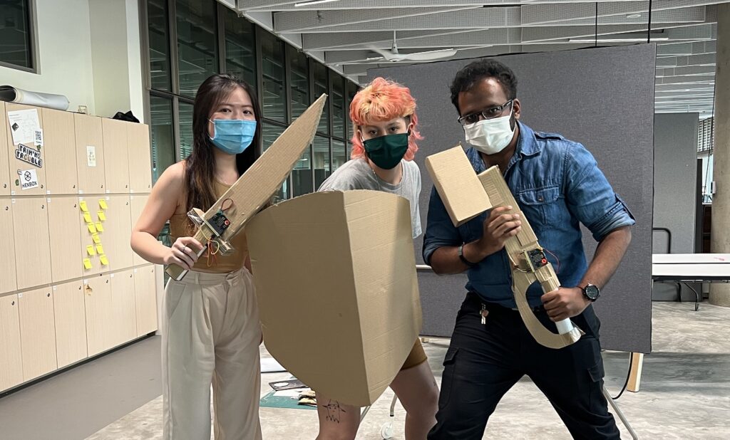
Cardboard Dungeons re-imagines children’s play by blending technology with the power of imagination. Aimed at 9 to 11-year-olds, this game transforms everyday surroundings into an interactive adventure. As players, kids choose roles, from heroes wielding D.I.Y weapons to a Game Master crafting the story and challenges.
The game uses smartphones to bring these homemade weapons to life, integrating motion detection with sound and vibration feedback for an immersive experience. It’s designed to foster teamwork, problem-solving, and creativity, encouraging kids to collaborate and think creatively to overcome challenges.
As a working prototype and proof of concept, this project showcases innovation in game design, the ability to engage young audiences, and the integration of technology with traditional play.
The creative origins
The brief for this 11 week project was to challenge the magic circle associated with video games and to design playful and tangible experiences using accessible technology. Knowing that Vivita Singapore were the collaborators for this project, we knew that we had the opportunity to deploy and discuss our prototypes with Vivita members down the design process.
We started off consolidating references and starting with a “what if” approach. Taking inspirations from interactable and haptic toys like the view-master and Lego, provided a good starting point for interaction points, while taking references from games and anime like Pokemon and Naruto proved as essential world building components. We also gave ourselves the constraints of ‘cardboard’ to ensure the accessibility of the experience.
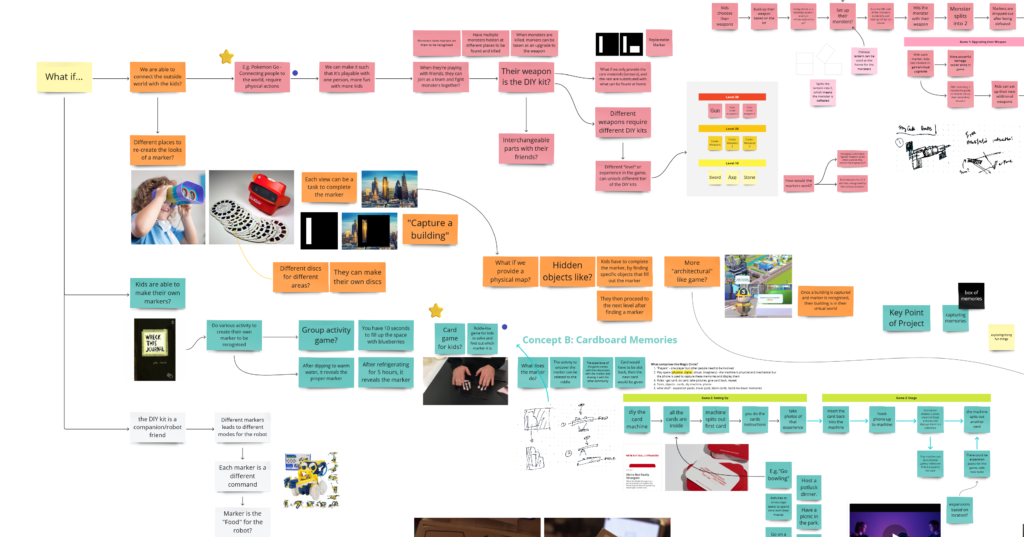
By the third week, three distinct main ideas had been fleshed out. These ideas covered the whole User Experience flow all the way from receiving packages, setting up and playing the game and not forgetting wrapping up of the whole system – the last thing anyone wants is more toys scattered in the house.
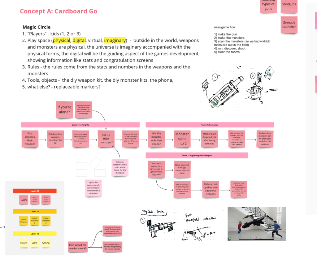
Cardboard Go – A game inspired by Pokemon Go. Players split into hiders and seekers – hiders hide DIY cardboard beacons of “monsters” around an outdoor space, while seekers find and attack the beacons.
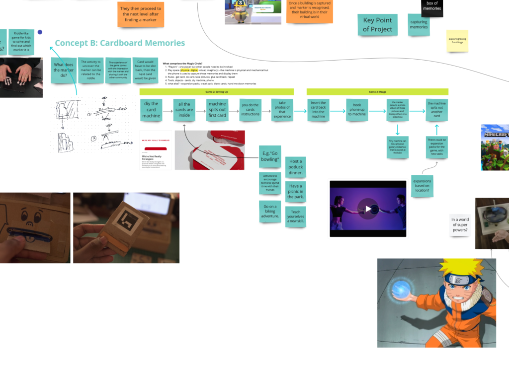
Cardboard memories – A game that aims to solve the age old questions of “So bored, what shall we do today?”. It is designed as a family bonding game where digital “game quests” are hidden in real life cards. These quests can be anything from “climb a mountian with Dad” to “get some icecream with Mom”.
While doing these “quests” the pictures can be taken and saved to galleries using the QR code on the quest card. When arriving back home, the quest card and be then placed back into the machine – which will then display random memories on the screen from all the adventures.
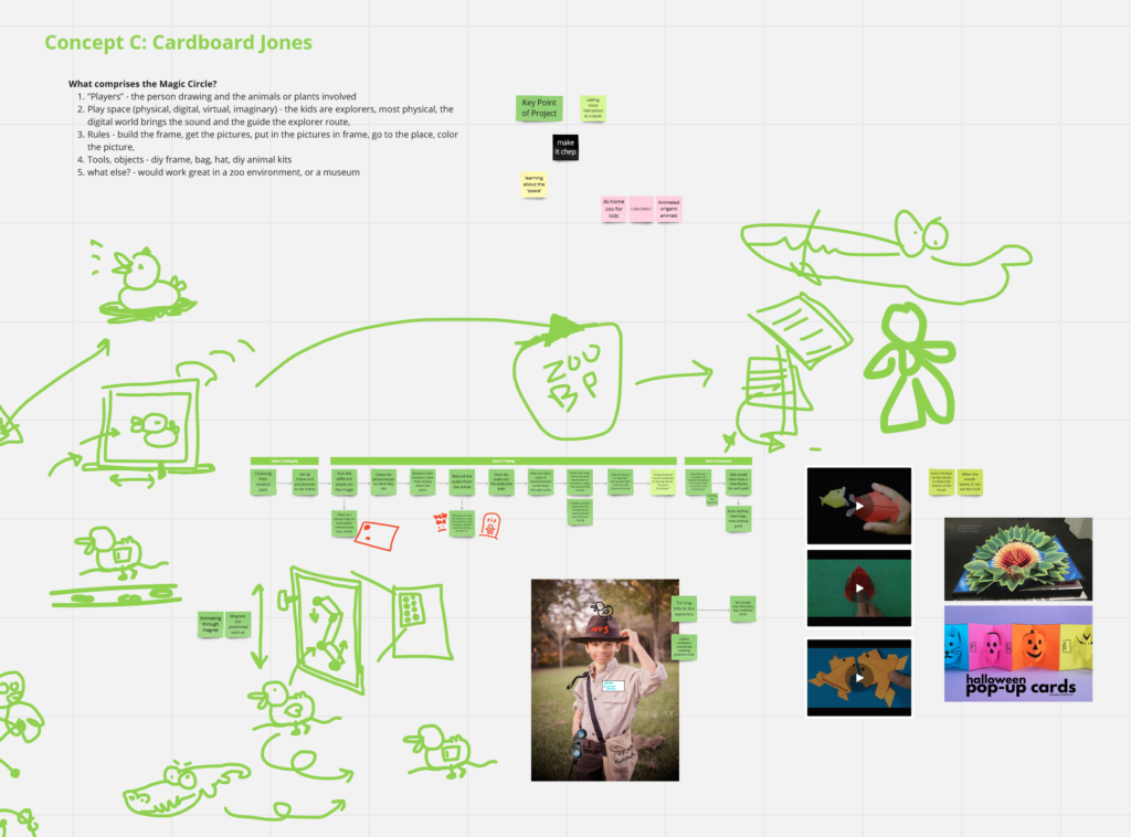
Cardboard Jones – A game that aims to make visits to make spaces more memorable using a memorabilia. In the context of a zoo, D.I.Y cardboard origami pieces can be places around different exhibits. When assembled these D.I.Y origami pieces can then be put together and be interacted with.
If these DIY peices are tagged with a smart base, it can also extend the visit by keeping users updated with new arrivals at the zoo or musuems.
The first prototype
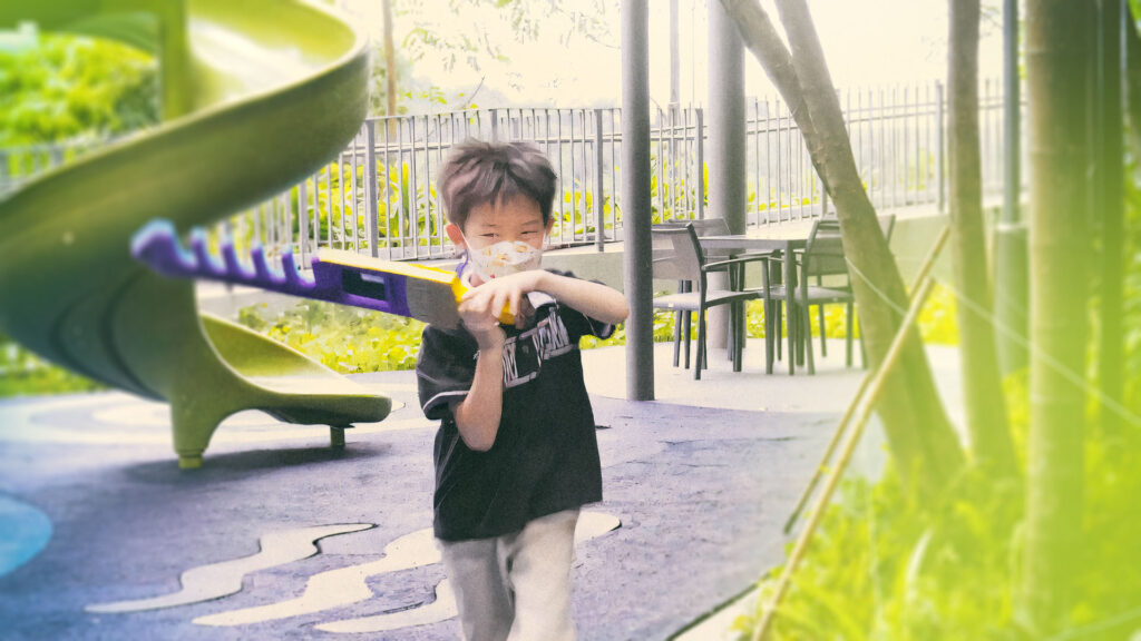
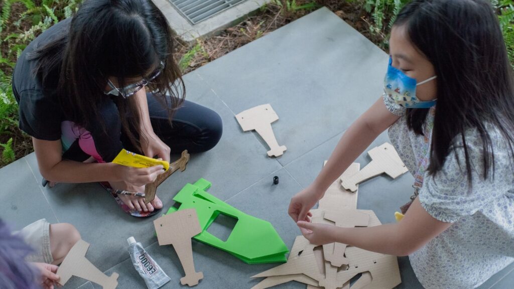
Around week six, we rounded up a group of our friends to test out the first iteration of C&D. This was one of the quick iterations where we had combined multiple elements of the initial ideas to make a quick game – one where people run around, swing comically huge swords at invisible monsters!
The prototype quickly tested fun factor and haptics, receiving positive feedback. However, visualizing invisible monsters and knowing where to hit proved difficult for players. Suggestions included adding a display for monster locations to improve the game.
Reflecting on feedback about the challenge of visualizing invisible monsters, further observations within similar age groups showed that children’s imaginative play allows them to engage deeply without actually seeing the monsters. This insight shifts our focus from visualization to the necessity of clearly indicating the monster’s location in the game area, ensuring players can coordinate their attacks effectively. This underlined the importance of spatial awareness in enhancing the game’s collaborative aspect.
The change in gameplay
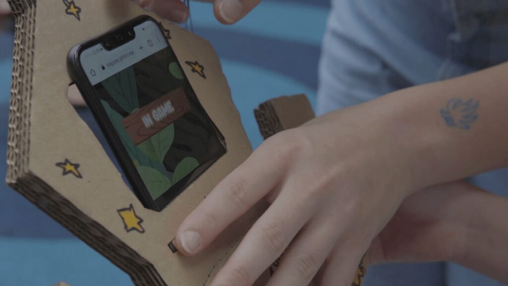
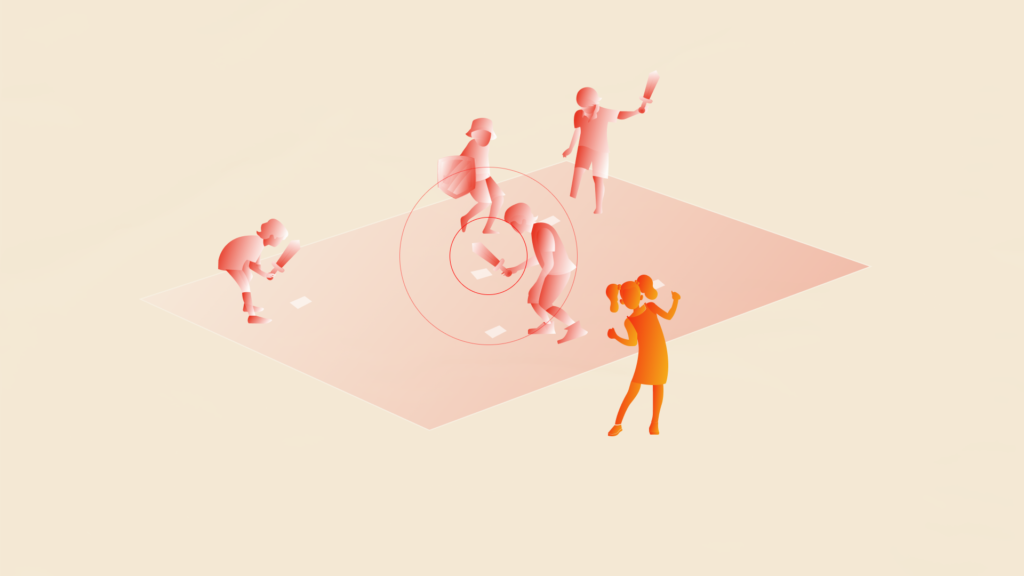
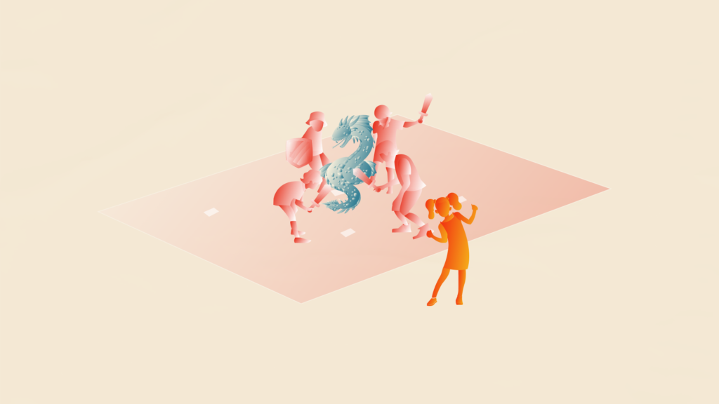
Over the next few weeks, we shifted the gameplay mechanics – taking inspiration from Dungeons and Dragons. The initial game loop looked like this. First, a game master is selected. They place QR codes around the play area – these work as monster spawn points. Using an app, the gamemaster spawns monsters – and the players use their phones to scan around (the QR codes) trying to find the monster. Once found, they take out their swords and attack the monsters. The goal is to see how many monsters the party clears before the clock runs out.

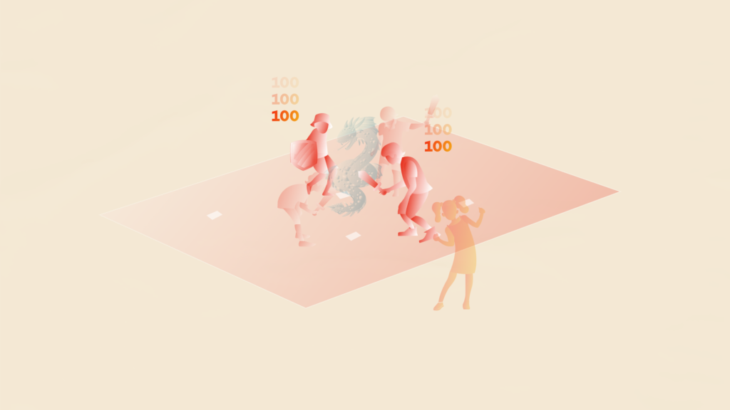
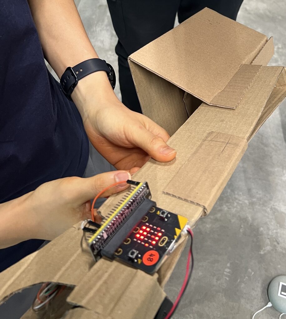
Upon further review, we realised that we could combine the functions of the scanner (phone) and the functions of a sword – as the phone is able to vibrate on swing as well, if we could somehow figure out how to use the acceleorometers in the phone.
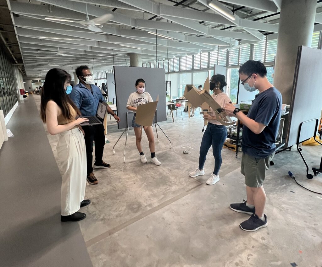
The second prototype
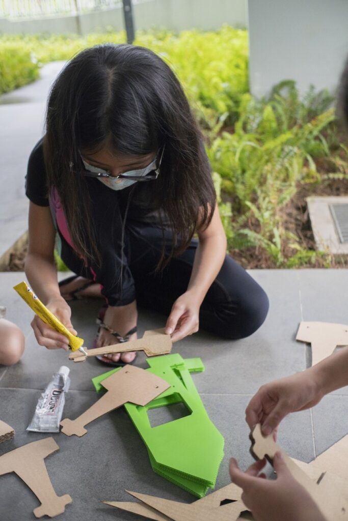
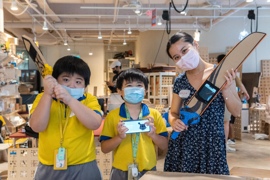
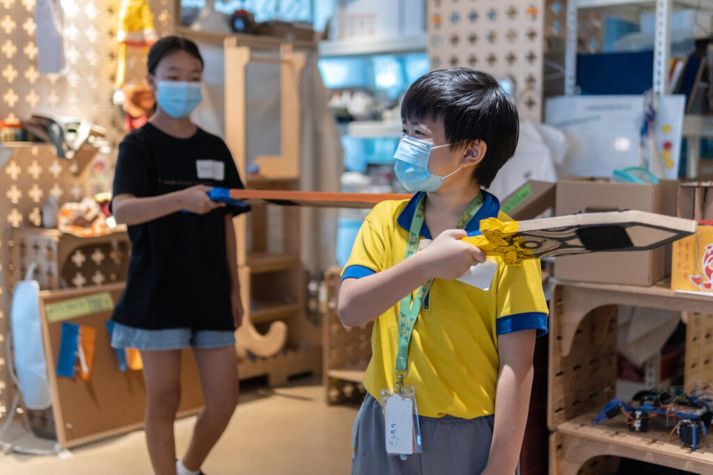
For our second test at week 10, we went all in. After the we came up with the full on userflow, we split tasks. Aileen was spearheaded the UIUX and front end dev, Mars took over the templates and fabrications for the cardboard swords.


I took over the interaction logic, using the accelerators and gyroscope to figure out where the user is facing, and the direction they are stabbing. I’m not a coder, and this was before the era of ChatGPT - so there was a whole of panicking and sleepness night that went on.
The challenges were quite insane – as the normals of the gyro kept flipping bases on if the phone was facing up or down. This means, if you tilt your phone up or down, the gyroscope gets a bit confused. It’s like when you’re spinning around and suddenly don’t know which way is up or down. If you’re interested, feel free to ask me in detail, I still have all the testing tools I created to assist at this stage.
With enough willpower and overnight dimsum though, nothing is impossible – and we finally had a working game with multiplayer (that was another headache) and working haptics with stabbing detections.
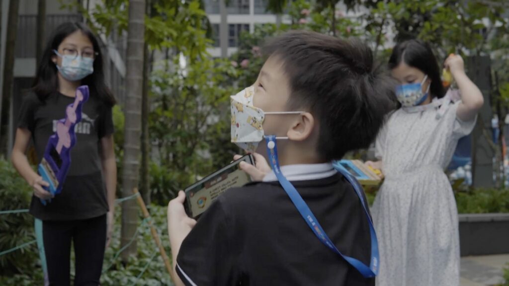
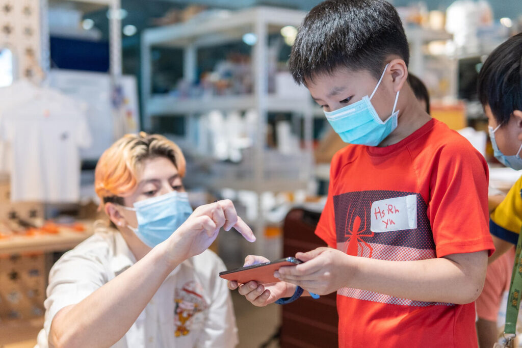
This time round, we had the opportunity to test it with participants from VivitaSG – who were a perfect fit for our target group. The experience was well received as the app was easy to use (thanks Aileen!) and the worked with a good accuracy. There were still plenty of bugs at this point (including a bug where you could spawn infinite attacks without cooldowns.
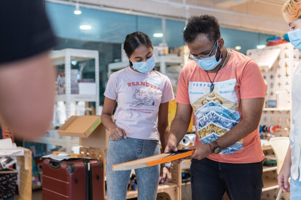
A main take away at this point was when we noticed that our participants instinctively slash instead of stab at the monsters when a sword was passed to them. Instead of fighting this change, we decided to change to slash attack on our final version.
The conclusion
Wrapping up this adventure, I’ve got to say, it was quite the ride. From brainstorming concepts to figuring out how to turn a swing into a digital action, every step was packed with its own set of hurdles. Yet, the outcome — a working proof of concept — has been incredibly rewarding. It not only validated our capabilities as interaction designers but also provided us with invaluable insights into developing physical interactions for digital devices.
This experience, though taxing, was a significant learning curve, pushing us to explore, iterate, and ultimately grow in ways we hadn’t anticipated. Good times!
